Designing The Staance Experience (2020)
- Feb 14, 2022
- 6 min read
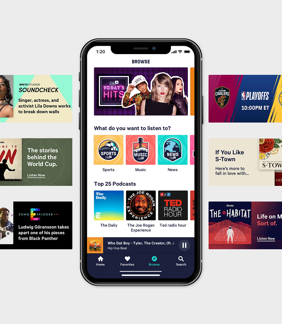
2019 was a year of significant transition for Staance business. I was part of an ambitious project called THE STAANCE PLATFORM. This is my story of Designing a web and mobile app that is a fast, at scale and iterative way to get fast studies for answers at the fingertips.
To comply with my confidentiality agreement I have omitted and appropriated confidential information.
These designs are a reinterpretation of the original.

The Staance Platform is a fast, at scale and iterative way for brands and market researchers to get fast studies for answers at the fingertips.
My Role
This project took place between September 2019 and May 2020. I was part of a small team alongside Emannuel Momoh, Agnieszka Opilska,Marios Anapliotis, and Krystian Kkoscielniak. I was responsible for the research, Planning & Scope Definition, interaction design, visual design, copywriting and branding.
The Challenge
2 Apps in 2 Months
After the design of the Staance study viewer MVP. Staance needed to move forward fast on the business side to have a way to create, target, and analyze a study. This was the only way Staance could generate revenue and get the series B funding they wanted.
Our team was under extreme pressure to move fast. We were tasked to deliver an iPhone and Web app high‐fidelity prototype and handoff designs to our engineering team within 2 months.
The combination of a fixed deadline, app store submission time, QA testing, and usability testing meant I needed to get the experience right in the first six weeks.
The Approach
Focusing on F̶e̶a̶t̶u̶r̶e̶s̶s Goals
Based on our previous interviews with market researchers and companies in the 2018 IIEX market research Conference we knew what the users wanted we now needed to figure out how to solve their needs.
In trying to solve their need we were tasked to develop better functionality than our client's competitors, we stressed that engaging in a feature parity war was neither strategic nor had the best interests of the app's users at heart.
To differentiate ourselves in an already mature and competitive market, we needed to define a desirable role for the app and how it would meet the needs of market researchers. We were thrilled by the opportunity to create something more meaningful.
We used the design thinking approach to empathize, define, ideate, prototype, and test. We did this for each phase of the product. The creation phase, the targeting phase and the analyzing phase of the staance platform
Research Insights
We conducted customer and market research to drive our planning phase. These are the key insights that defined the launch version of the product:
"👫 Insufficient sample sizes"
"📆 12-14 weeks turnarounds which has not iteration and its not agile"
"👩🎨 I need to have the skill of a graphic and survey designer"
"🕵️♂️ Indirect and aggregated data"
"😒 Analyzing data is boring"
"🤯 Creating a study is complicated and painful UX"
Understanding the Users
“We used personas constantly throughout the project to guide design decisions, priorities, and create empathy amongst the client and our team.”
Based on our previous research we created a persona that captured the various patterns , motivation and attitude we saw across the interviews.
The app focused on supporting the goals of Jaime , who was our primary persona and then secondary Persona was Catt , Jeff & Mary.

The Framework
Structuring Content First
My earliest design challenge was how to display content on the dashboard. Before starting any design, we spent a great deal of time making sense of workflows and existing content. This involved a tonne of task analysis and also performed a hierarchical card sort with four participants. My aims were to understand how Market Researchers thought about different categories of content and what was most important to them in the context of creating and analyzing a study.

Visual Thinking on Paper
I used storyboarding to have a visual story to describe the user's experience from creating a study, targeting a study, and analyzing a study. I put the storyboard board in front of some market researchers to get their feedback and asked follow up questions to get a deep understanding of how they are thinking about the concept I had.
In order to help understand many of the complex processes involved in creating a study and analyzing data, I mapped workflows on paper. Doing so helped me to understand the particular points where our system could help minimize some of the pain market researchers experienced as well as highlight opportunities where we could really try to innovate.

Setting the Design Direction
We took a top‐down approach to define the overall structure of the experience. Sketching, I generated stacks of ideas about the arrangement of UI, functional and data elements, and interactive behaviors. Starting broad, our vision began evolving into something tangible. A high‐level design language, interactions, and the app's anatomy began to piece together.

Detailed Design
Creating a Design System
The Complex Nature of the app necessitated more than 80 screens Covering the Dashboard, Audience Targeting, Settings, Billing, Design Studio, Staance stories, and more.
To maintain consistency and ensure efficient design to dev handover, I developed a modular design system based on reusable components and their states, Such as Navigation, data entry, data display, and feedback components. Every component can be rearranged and combined with others while maintaining design consistency and recognizable UI patterns for the user.

Detailed Design
Creating a Design System

The interface design strives to be confident. It does not contain UI‐bling or unnecessary elements. We opted for clear, readable typography —choosing colors with high contrast to increase legibility and solve the major problem market researchers have which is complicated and painful UX. The design is uncluttered, clean, large and well spaced. All our design decisions help to exude a sense of confidence in the design.
Creating a Design System

With the problem of insufficient sample sizes and also indirect and aggregated data we decided to create an audience targeting platform that could target over 2 Billion people on-demand with smart distribution based on US Census data via the Facebook network.

We also designed the audience targeting system to accommodate a custom audience upload from TXT and CSV documents. Which was something we got from our research that market reachers needed.

After Targeting to Facebook we generated Facebook Ads so users could click and land into the study. These Ads worked with a graphic engine automatically. We also took into context facebooks 20% text rule for Ads
Design Studio

Based on the research insight we got which was “I need to have the skill of a graphic and survey designer” We designed an easy to use straight forward graphics editor that could search for images based on assertions, upload videos and media content to create a Staance.
Analyzing the data through stories

Analyzing data for market researchers and the public is mostly boring based on the data from our research. One of the best ways to inform people in a fun way is by telling a story. So we decided to design part of our data output platform in a story format for mobile and desktop. Flashcards have been an effective way people learn so we decided to tell our story for mobile in a flashcard form, where users get insights from different cards.

For The MVP We Decided To Tell Our Stories in 3 Forms
MAX
Reveals the demographic groups who disagree and agree the most with specific Staances

Demographics
Explore Staances by demographics

Pattern
Explore patterns of strong correlation between people holding specific ideas

The Refinement
Testing with User
I worked closely with our Usability Testing partner to help define tasks, establish objectives and evaluate the app.
To ensure the test was realistic, we opted to use a real build of the application. However, this revealed how functionally unstable the app was. Between the times spent recovering from bugs and app crashes we were able to find usability issues related to perceived affordances, layout and search.
Working with The Developers
I worked closely with our developers on this project Ankish, Stratos, Tim, Krystian and Raj to bring our designs to life. Communicating requirements face-to-face and remotely. Discussing constraints and possibilities was an effective way of solving the Interaction Design. We worked collaboratively, tested constantly and iterated progressively.
The Impact
Positive Results and Much More to do
The Staance platform app had a positive impact on the market research experience, at the time of writing (2 months since launch). Staance already has a lot of big multinationals using this as a platform as a way to get fast , agile and iterative answers to their research questions.
For confidentiality reasons I have omitted the actual values metrics of the impact of this project.


Comments